
React-Select(SELECCION MULTIPLE)

Es un control de entrada selectivo flexible para ReactJS con soporte de selección múltiple, autocompletado, asíncrono y creatable.
Esta creado por Jed Watson
React Select está financiado por Thinkmill y Atlassian.
Característica
- Enfoque flexible de los datos, con funciones personalizables.
- API de estilo extensible con emoción
- API de inyección de componentes para un control completo sobre el comportamiento de la interfaz del usuario
- Accesorios de estado controlables y arquitectura modular
- Funciones solicitadas durante mucho tiempo como grupos de opciones, soporte de portal, animación y más
Props comunes
- autoFocus – enfoca el control cuando se monta
- className – aplicar un className al control
- classNamePrefix – aplicar classNames a elementos internos con el prefijo dado
- isDisabled – deshabilitar el control
- isMulti – permitir al usuario seleccionar múltiples valores
- isSearchable – Permitir al usuario buscar opciones coincidentes
- name – generar una entrada HTML con este nombre, que contenga el valor actual
- onChange – suscribirse para cambiar eventos
- options – especificar las opciones que el usuario puede seleccionar
- placeholder – cambiar el texto que se muestra cuando no se selecciona ninguna opción
- value – controlar el valor actual
Props Controlable
Puede controlar los siguientes accesorios al proporcionarles valores. Si no lo hace, react-select los gestionará automaticamente.
Value(union)/onChange(function)– especificar el valor actual del controlmenuIsOpen/onMenuOpen/onMenuClose– controlar si el menú está abiertoinputValue/onInputChange– controla el valor de la entrada de búsqueda (al cambiar esto se actualizarán las opciones disponibles)
Si no proporciona estos accesorios, puede establecer el valor inicial del estado que controlan:
defaultValue(string)– establecer el valor inicial del controldefaultMenuIsOpen(boolean)– establecer el valor inicial abierto del menúdefaultInputValue(union)– establecer el valor inicial de la entrada de búsqueda
Methods
React-select expone dos métodos públicos:
focus()– enfocar el control mediante programaciónblur()– difuminar el control mediante programación
Instalacion de React select
//instalar con yarn
yarn add react-select

//instalar con npm
npm install react-select
Mostracion de uso de React select
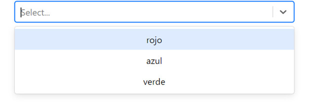
ejemplo basico de select
Para utilizar Componente react select necesitamos utilizar etiqueta <Select> y llenar el atributo options con una Array [ ] .
utilizamos el metodo de onChange para capturar el value del option que hemos selecionado.
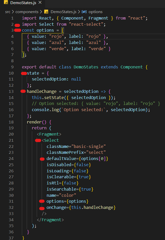
import React, { Component, Fragment } from "react";
import Select from "react-select";
const options = [
  { value: "rojo", label: "rojo" },
  { value: "azul", label: "azul" },
  { value: "verde", label: "verde" }
];

export default class DemoStates extends Component {
  state = {
    selectedOption: null
  };
  handleChange = selectedOption => {
    this.setState({ selectedOption });
    // Option selected: { value: "rojo", label: "rojo" }
    console.log(`Option selected:`, selectedOption);
  };
  render() {
    return (
      <Fragment>
        <Select
          className="basic-single"
          classNamePrefix="select"
          defaultValue={options[0]}
          isDisabled={false}
          isLoading={false}
          isClearable={true}
          isRtl={false}
          isSearchable={true}
          name="color"
          options={options}
          onChange={this.handleChange}
        />
      </Fragment>
    );
  }
}
Ejemplo de selecion multiple
es lo mismo que el ejemplo de select siemplo solo tenemos que añadir el attributo isMulti
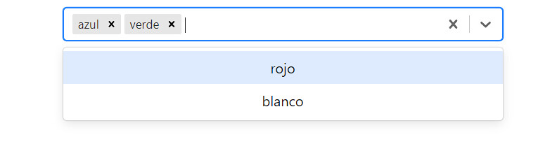

cuando añadimos el attibuto isMulti es value del Select va a ser un Array de objeto
import React, { Component, Fragment } from "react";
import Select from "react-select";

const options = [
  { value: "rojo", label: "rojo" },
  { value: "azul", label: "azul" },
  { value: "verde", label: "verde" },
  { value: "blanco", label: "blanco" }
];

export default class DemoSelectMultiple extends Component {
  state = {
    selectedOption: null
  };
  handleChange = selectedOption => {
    this.setState({ selectedOption });
    // Option selected: { value: "rojo", label: "rojo" }
    console.log("Option selected:", selectedOption);
  };
  render() {
    return (
      <Fragment>
        <Select
          isMulti
          options={options}
          value={this.state.selectedOption}
          onChange={this.handleChange}
          closeMenuOnSelect={false}
        />
      </Fragment>
    );
  }
}
Más Funcionalidades del React Select
Efecto Animados
utilizamos el makeAnimated para añadir el efecto de animación al Select


import React, { Component, Fragment } from "react";

import Select from "react-select";
import makeAnimated from "react-select/animated";

const options = [
  { value: "rojo", label: "rojo" },
  { value: "azul", label: "azul" },
  { value: "verde", label: "verde" },
  { value: "blanco", label: "blanco" }
];

const animatedComponents = makeAnimated();

export default class DemoAnimation extends Component {
  render() {
    return (
      <Select
        closeMenuOnSelect={false}
        components={animatedComponents}
        defaultValue={[options[1], options[2]]}
        isMulti
        options={options}
      />
    );
  }
}
Estilos personalizados con Select Simple
Podemos Diseñar componentes individuales con CSS personalizado, utilizando el accesorio de estilos.
Import para añadir un estilo personalizado nececitamos instalar el libreria chrome-js
npm install chroma-js


import React from "react";
import chroma from "chroma-js";
import Select from "react-select";

const options = [
  { value: "red", label: "rojo", color: "#FF5630" },
  { value: "blue", label: "azul", color: "#0052CC" },
  { value: "green", label: "verde", color: "#36B37E" },
  { value: "orange", label: "naranja", color: "#FF8B00" }
];

const dot = (color = "#ccc") => ({
  alignItems: "center",
  display: "flex",

  ":before": {
    backgroundColor: color,
    borderRadius: 10,
    content: '" "',
    display: "block",
    marginRight: 8,
    height: 10,
    width: 10
  }
});

const colourStyles = {
  control: styles => ({ ...styles, backgroundColor: "white" }),
  option: (styles, { data, isDisabled, isFocused, isSelected }) => {
    const color = chroma(data.color);
    return {
      ...styles,
      backgroundColor: isDisabled
        ? null
        : isSelected
        ? data.color
        : isFocused
        ? color.alpha(0.1).css()
        : null,
      color: isDisabled
        ? "#ccc"
        : isSelected
        ? chroma.contrast(color, "white") > 2
          ? "white"
          : "black"
        : data.color,
      cursor: isDisabled ? "not-allowed" : "default",

      ":active": {
        ...styles[":active"],
        backgroundColor:
          !isDisabled && (isSelected ? data.color : color.alpha(0.3).css())
      }
    };
  },
  input: styles => ({ ...styles, ...dot() }),
  placeholder: styles => ({ ...styles, ...dot() }),
  singleValue: (styles, { data }) => ({ ...styles, ...dot(data.color) })
};

export default () => (
  <Select
    defaultValue={options[2]}
    label="Single select"
    options={options}
    styles={colourStyles}
  />
);
Estilos personalizados con Select multiple
Es lo mismo que el simple solo tenemos que modificar el metodo de colourStyles
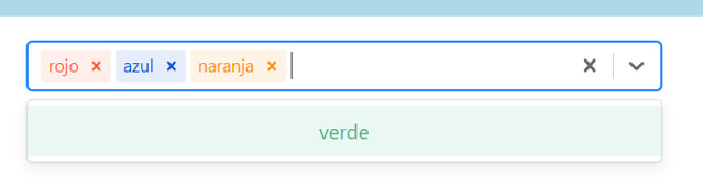

import React from "react";
import chroma from "chroma-js";

import Select from "react-select";

const options = [
  { value: "red", label: "rojo", color: "#FF5630" },
  { value: "blue", label: "azul", color: "#0052CC" },
  { value: "green", label: "verde", color: "#36B37E" },
  { value: "orange", label: "naranja", color: "#FF8B00" }
];

const colourStyles = {
  control: styles => ({ ...styles, backgroundColor: "white" }),
  option: (styles, { data, isDisabled, isFocused, isSelected }) => {
    const color = chroma(data.color);
    return {
      ...styles,
      backgroundColor: isDisabled
        ? null
        : isSelected
        ? data.color
        : isFocused
        ? color.alpha(0.1).css()
        : null,
      color: isDisabled
        ? "#ccc"
        : isSelected
        ? chroma.contrast(color, "white") > 2
          ? "white"
          : "black"
        : data.color,
      cursor: isDisabled ? "not-allowed" : "default",

      ":active": {
        ...styles[":active"],
        backgroundColor:
          !isDisabled && (isSelected ? data.color : color.alpha(0.3).css())
      }
    };
  },
  multiValue: (styles, { data }) => {
    const color = chroma(data.color);
    return {
      ...styles,
      backgroundColor: color.alpha(0.1).css()
    };
  },
  multiValueLabel: (styles, { data }) => ({
    ...styles,
    color: data.color
  }),
  multiValueRemove: (styles, { data }) => ({
    ...styles,
    color: data.color,
    ":hover": {
      backgroundColor: data.color,
      color: "white"
    }
  })
};

export default () => (
  <Select
    closeMenuOnSelect={false}
    defaultValue={[options[0], options[1]]}
    isMulti
    options={options}
    styles={colourStyles}
  />
);
Creatable
El componente Creatable permite a los usuarios crear nuevas opciones junto con la elección de opciones existentes, utilizando actionMeta .


import React, { Component } from "react";

import CreatableSelect from "react-select/creatable";

const options = [
  { value: "red", label: "rojo", color: "#FF5630" },
  { value: "blue", label: "azul", color: "#0052CC" },
  { value: "green", label: "verde", color: "#36B37E" },
  { value: "orange", label: "naranja", color: "#FF8B00" }
];

export default class DemoCreaTable extends Component {
  handleChange = (newValue, actionMeta) => {
    console.group("Value Changed");
    console.log(newValue);
    console.log(`action: ${actionMeta.action}`);
    console.groupEnd();
  };
  render() {
    return (
      <CreatableSelect isMulti onChange={this.handleChange} options={options} />
    );
  }
}
Opciones fijas
Podemos añadir una o mas de una opcion fija

Importante tenemos que añadir isFixed :true al objeto del options que quiere estar de fijo.


import React, { Component } from "react";

import Select from "react-select";
const options = [
  { value: "red", label: "rojo", color: "#FF5630", isFixed: true },
  { value: "blue", label: "azul", color: "#0052CC" },
  { value: "green", label: "verde", color: "#36B37E" },
  { value: "orange", label: "naranja", color: "#FF8B00" }
];

const styles = {
  multiValue: (base, state) => {
    return state.data.isFixed ? { ...base, backgroundColor: "gray" } : base;
  },
  multiValueLabel: (base, state) => {
    return state.data.isFixed
      ? { ...base, fontWeight: "bold", color: "white", paddingRight: 6 }
      : base;
  },
  multiValueRemove: (base, state) => {
    return state.data.isFixed ? { ...base, display: "none" } : base;
  }
};

const orderOptions = values => {
  return values.filter(v => v.isFixed).concat(values.filter(v => !v.isFixed));
};

export default class DemoOpcionFijo extends Component {
  state = {
    value: orderOptions([options[0], options[1], options[3]])
  };

  constructor(props) {
    super(props);

    this.onChange = this.onChange.bind(this);
  }

  onChange(value, { action, removedValue }) {
    switch (action) {
      case "remove-value":
      case "pop-value":
        if (removedValue.isFixed) {
          return;
        }
        break;
      case "clear":
        value = options.filter(v => v.isFixed);
        break;
    }

    value = orderOptions(value);
    this.setState({ value: value });
  }

  render() {
    return (
      <Select
        value={this.state.value}
        isMulti
        styles={styles}
        isClearable={this.state.value.some(v => !v.isFixed)}
        name="colors"
        className="basic-multi-select"
        classNamePrefix="select"
        onChange={this.onChange}
        options={options}
      />
    );
  }
}
Autor: YIBING JIN
Curso: Microsoft MCSA Web Applications + Microsoft MCSD App Builder + Xamarin
Centro: Tajamar
Año académico: 2019-2020
informacion : https://react-select.com/
Linkedin GitHub
Gracias por tu articulo, me ha servido mucho! Saludos.